March 27, 201412 yr Grey or pale blue would be my preference, with Y and C on reverse, but happy to go with majority.
March 27, 201412 yr for fuck sake, they don't do GREY. he told you what colours they do.. but in contradiction to my last post , that grey print looks shit and rather blobby . we all liked the original design though..
March 27, 201412 yr Yip 380 odd posts and there is still no decision.....Imagine if we were talking about what oil to use in a bike or summit
March 27, 201412 yr Moderator 3 design is the best, can we just agree on colour. Llaallala can we have a swatch of the switcher colours? found one here http://m.switcher.com/pub/switcher-cat14-CH/HTML/files/assets/basic-html/index.html#page9
March 27, 201412 yr i`m sure switcher do all colours but also they have BIG prices, over 20 pounds for one T-shirt (this is what I saw on their website). BUT those colours can my friend take from them at a resonable price. also i`m not sure if this kind of printing my friend do, can be done on ANY kind of T-shirt.. its called serigraphy http://en.wikipedia.org/wiki/Screen_printing this is why some colours don`t look good over others. also using diferent colours mean more work so, a bigger bill. this is why I tell him to leave one colour on front I will ask him if he can do for us both grey and blue and we will see what colours will look good on every base I will wait until you decide about the model and after we have the model we will see what he can do to get some good quality t-shirts grey, switcher or not.
March 27, 201412 yr I'm glad I don't drink in the same pubs Imagine being stuck behind you lot at the bar
March 27, 201412 yr Why don't we all just turn up with no tops on and kev can draw the design on us with a biro?
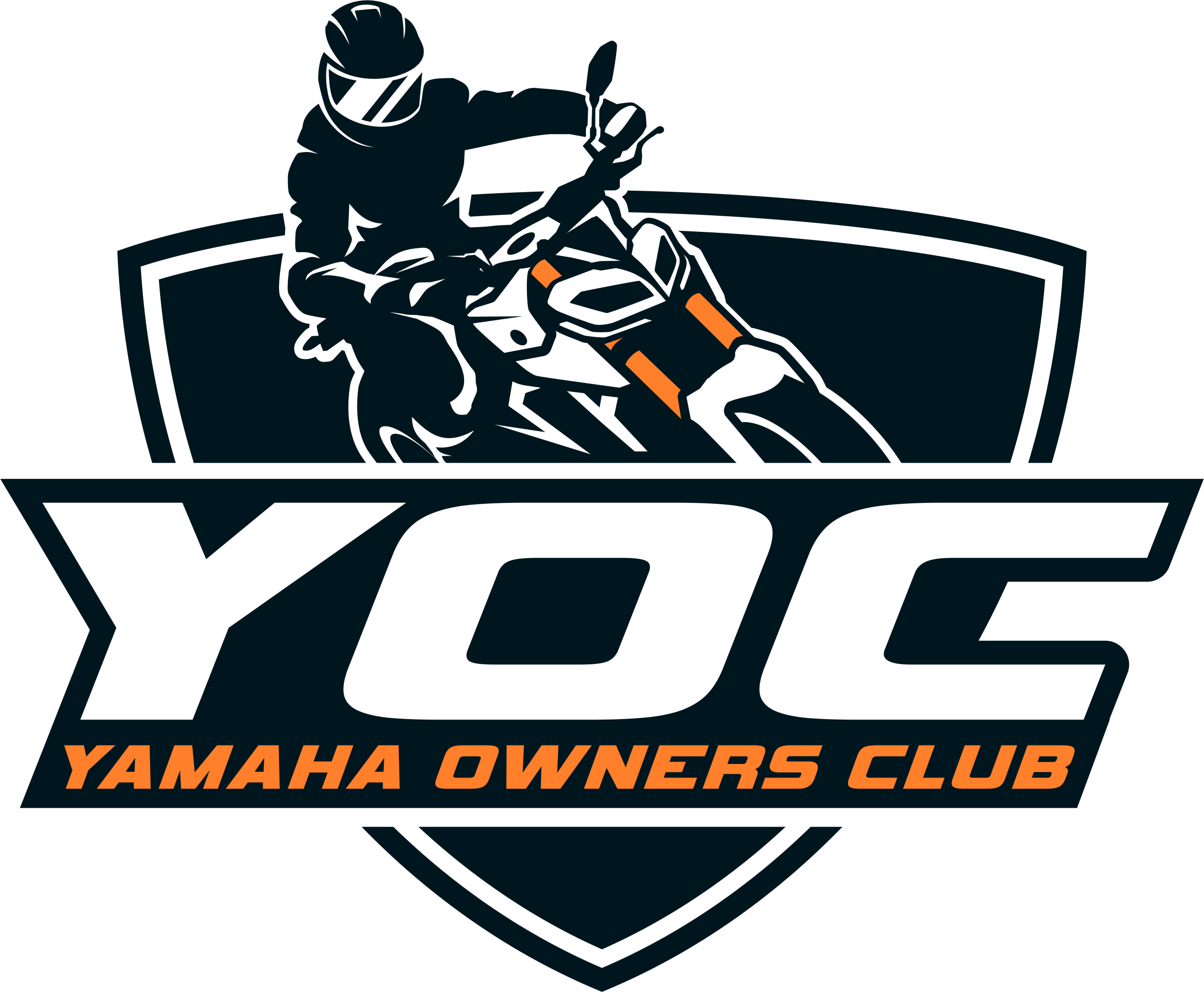
March 27, 201412 yr I agree with Jimmy the original one by DDT is far better, these look a bit tackie, it was stone green and the lettering, colour's, and font looked better I know its not easy to please everyone but I'm sure we'll get there, its amazing your mate can reproduce the image so well though Lassy big thumbs up for that just a little bit more work and we'll all be happy
March 27, 201412 yr F**k it" am away for a whisky ............. Make it a double John, I reckon we'll have a Tshirt by page 24
March 27, 201412 yr have a piss around on here guys and gals . http://www.tshirtstudio.com/t-shirt-printing/design-your-own-t-shirt?gclid=COvIu67rs70CFdHLtAod-UEAHw
March 31, 201412 yr Moderator I have all the money, the sizes and the addressees. In other words......


Join the conversation
You can post now and register later. If you have an account, sign in now to post with your account.